 Log in
Weather Data Graphic
The weather data graphic shows the data recorded by your weather station and the weather forecast for the coming days.
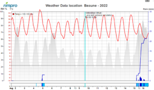
The vertical cyan line is the moment NOW that separates the last data send by the weather station (left) from the most recent forecast (right).
The dark blue in the lower bar stands for the hours of active rain—light blue for the leaf wetness hours as recorded by the station. In the upper graph, rain is shown in dark blue bars as halve hour value, and as accumulated rain over the rain event.
The grey area in the background indicates the relative humidity.
The red line indicates the temperature in Celsius.
In case you use a Virtual Station, the crop-wetness duration is calculated from humidity, temperature, radiation, and wind for 10 leaves of different positions and ages. You can see the result of these calculations in the graph “Virtual Leaf Wetness“.